How Much Liquidity Is In The US Treasury Market
One of the biggest concerns that keeps regulators and central bankers up at night is that as a result of over $23 trillion in QE, liquidity in the bond market has collapsed and even a modest shift in prevailing sentiment would have outside – and potentially dire – consequences. For an example of how illiquid decades of QE has done to what was once one of the deepest, most liquidity markets, look no further than the Japanese Treasury, or JGB, market where frequently there are days without a single trade transaction taking place. Which is perhaps not all that surprising in a world where central banks have become the marginal price setters.
With that in mind, and considering that QE continues at a relentless pace even as net coupon issuance in the US has shrunk substantially, leading to an increasing drain by the Fed of treasuries held by the private sector, how should one go about estimating the liquidity in what is widely viewed as the world’s deepest and most liquid market in the world, that of US Treasuries.

To answer this question, a recent analysts by Goldman chief rates strategist Praveen Koarapty looks at market depth – among the more commonly used market liquidity metrics – which he measures as the average of the cumulative bid/ask sizes prevalent at the top three levels of the order stack between 8:00-10:30am EST (this is the time window when most important US economic data are released, and hence when liquidity should be most concentrated intraday) .
The first chart below shows the market depth for TY futures (in number of contracts) and on-the-run 7y USTs (in $MM) over the past year. As can be seen, liquidity in the futures and cash markets track each other fairly well; both show a pronounced, if brief, drop in market depth in late February this year.

Why should market depth be considered a liquidity metric? According to Goldman, depth measures the extent of risk that can be transacted without moving too far down the order stack, and hence the magnitude of order flow that shouldn’t affect prices “too much.” Of course, depth is only partially reflective of liquidity conditions in that it measures the “supply” of liquidity, and not the demand. On days when market order flow (“demand”) is low, a relatively low level of market depth does not necessarily mean a disorderly market. Further, the depth metric by itself doesn’t provide a clear sense of relative liquidity, i.e., does $300mn in market depth imply a more orderly market than, say, $150mn market depth?
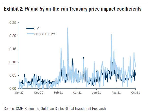
To estimate overall liquidity conditions in the market on a given day, Goldman estimates the price impact of signed order flow. Using intraday regressions of one minute snapshots of price changes and order flow (that nets out buy and sell market orders) over the same window that is used to measure market depth, the bank generated a daily series of price impact coefficients. These coefficients measure the dollar price sensitivity of a particular futures contract or bond per unit of net order flow over a given period. The result is shown in the chart below which maps the price impact coefficients per unit of net order flow (scaled to be $1bn of face value amounts) for both FV and on-the-run 5s. Similar to market depth, this metric also suggests conditions in the futures and cash market tend to be roughly similar, though they do visibly differ on some occasions.
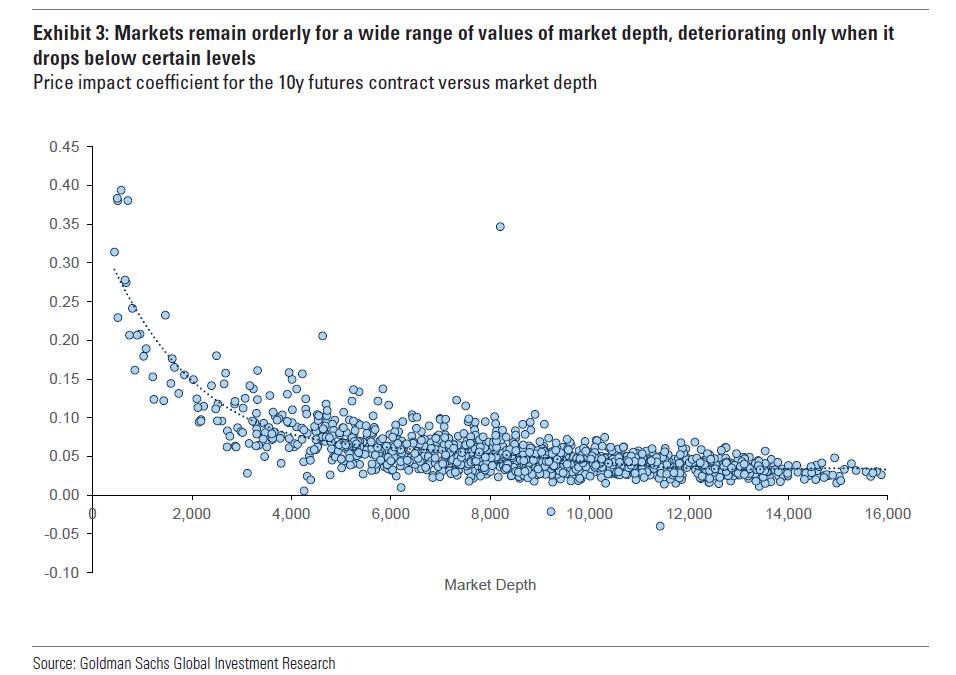
The relationship between the price impact coefficient and market depth for the commonly referenced 10y futures (TY) contract is shown in the next chart. As a rule of thumb, markets only start to become more disorderly in instances where TY contract depth drops below 4,000. Of course, this varies by contract and security—for 7y and 10y on-the-run USTs for instance, price impact coefficients are consistently elevated only when market depth drops below $50-$80mn.
What is the significance of these metrics and why do they matter?
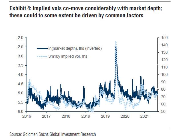
For several reasons. First, implied volatility correlates fairly well to the log of market depth (chart 4). Of course, there could be common factors driving both, but to the extent we can anticipate some seasonal variation or other reasons for a decline in market depth, we could calibrate potential increases in rate option volatility.
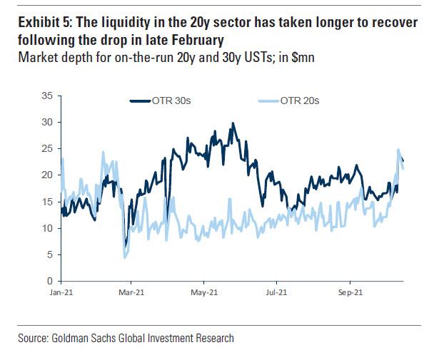
Second, we could examine the evolution of relative liquidity between various points on the curve to identify points that might require a greater illiquidity concession. For example, liquidity in 30y USTs appears to have recovered more quickly than that of 20y USTs following an across the board drop in February this year, suggesting potentially more structural issues at that maturity.
Overall, the main utility of these liquidity metrics is that it allows traders to quantify market liquidity conditions in a systematic manner. This will come in useful in a few months when the Fed’s taper – and subsequent rate hikes – will inevitably leads to treasury market turmoil as the buyer of last (and first) resort gradually fades away, and the world’s most important market is left to its own devices, something previous periods of “the Fed has left the building” have shown, it find extremely challenging and results in huge, VaR-shock inducing market swoons.
Tyler Durden
Sat, 10/23/2021 – 11:00![]()
Zero Hedge’s mission is to widen the scope of financial, economic and political information available to the professional investing public, to skeptically examine and, where necessary, attack the flaccid institution that financial journalism has become, to liberate oppressed knowledge, to provide analysis uninhibited by political constraint and to facilitate information’s unending quest for freedom. Visit https://www.zerohedge.com